Saturday, July 28, 2012

RED: 5 SKETCHBOOK EXERCISES & 5 COLOR STUDIES To Try


Try a few, or all, of these exercises, and you'll be "seeing red" -- in a good way, I hope.

For the first 5 RED exercises, you'll need your sketchbook, a pencil, a black pen, some watercolor pencils or colored pencils, some w/c paints, some magazines (you know you have some old ones lying around), a glue stick or "Yes" paste, and scissors.


1)  Draw a part of a red motorcycle, bicycle, tricycle, or wagon --  Draw a contour line drawing, with a black pen.  Don't worry about proportions, or whether you've drawn it correctly.  This is your sketchbook -- it doesn't have to be perfect.  "Perfect" is boring, anyway, don't you think?  Then, add some color, with a little red watercolor.  Add some shadows with cross-hatching in pen and a simple gray wash (or touch the edge of the black pen line with water to make a gray wash) . . .


2)  Draw a single flower, right in the middle of your page --  Draw with black pen -- then, add color with colored pencils and watercolor pencils.  Layer these colors -- starting with yellow first; then, add the reds.  Finish with some darks in purple. . . 


3)  Draw some red apples still on the tree -- First, draw 2 or 3 skinny rectangles on a page, and within that format, draw some apples on a branch, with a few leaves.  Draw this in pencil first.  Then color the apples red, the branch brown, and the leaves green.  Now, fill in the background with a gold.  You can use watercolor pencils, so you can use a wet brush over the pencil.  This is helpful for covering large areas, like the background.  When this is dry, go over all the lines, including the rectangle, with a black pen. . . 


Design these rectangles, so the apples and leaves are cropped, making interesting negative shapes.


4)  Draw the insides of your pantry -- Collect all the bottles/jars/containers from your cupboard or pantry, that contain the color red (not on the inside, but outside).  Arrange them on a shelf or two.  Draw a contour line drawing with a black pen, adding some cross-hatching.  Then, add a little color, with paint or colored pencils.  Add a few other colors, besides red, for contrast. . . 


(Now, put everything back the way it was . . . or not.)


5)  Make 2 color collages -- Gather some old magazines, and tear out some examples of red.  After you have a big pile of all shades and values of red, cut them into strips. . . 


Now, make three piles of these:  one pile of DARK REDS, one pile of MID-TONE REDS (this will be your brightest pile), and one pile of LIGHT REDS (pinks).

From the middle pile of MID-TONE REDS, arrange them from red-violet to cool red to warm red to red-orange. (The process is more important than the end result -- this is not an exact science). Now, glue this down on a page of your sketchbook.

Now, using some strips from each of the piles, make an arrangement where you go from darkest dark to lightest light, and glue those down.  

This is a good exercise to train your eye to see temperature changes within a color family, and to see value changes within the same color family.


--------------------------------------------------------------------------------------------------


For these next 5 color studies, use a watercolor sketchbook, if you have one, or scraps of good watercolor paper, or a pad of cheap watercolor paper, like 90 lb.  You'll also need a pencil, and your paints and brushes.


1)  Minglings --  On a few small scraps of watercolor paper, do some wet-in-wet minglings, using all the reds on your palette.  Wet each paper first, and while it's still wet, drop in the colors. . . 


Now, try another mingling -- but, this time, spritz the paper first, with clear water, then spatter on the paint.  Use all your red paints again.  Spritz it again with water, and then spatter on some other colors.


2)  Mosaic Blossom -- Using either a red flower from your garden or home, or a photo of a red flower (one with lots of petals -- like a geranium, or dahlia, or zinnia, or rose -- the more shapes, the better), start painting without drawing.  Start in the middle, and paint the first little shape.  Then, move out from there, painting each shape you see, one at a time.  Leave a tiny white space between the shapes, so you don't have to wait for one shape to dry, before painting the one right next to it.  Vary your reds with each shape. . . 


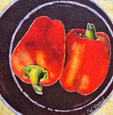
3) Red Peppers -- Draw and paint 1, 2, or 3 peppers, using both warm and cool reds within the pepper. Leave some white highlights, and be sure to paint the green stem, for contrast.  Arrange your peppers on a patterned tablecloth, a white sheet of paper, or in a black bowl . . . 


4)  Imaginary Bouquets (no drawing allowed)  --  Paint these bouquets very quickly and very small, so you won't worry about details.  The first one, paint a few red tulip shapes, a blue flower shape, and a few green shapes to indicate some stems and leaves.  Paint it onto dry paper.


In the 2nd little painting, paint the shape of a bouquet with clear water, and then drop in red for the flowers, and some yellow and blue for the leaves.  When that is dry, paint a red pot. . .     


5)  Close-up of a Red Flower -- Either looking at a real flower, or at a photo of one, draw it in pencil first.  Then, paint it, petal by petal, wetting it with clear water first and then using both cool and warm reds in the petals.  


Tuesday, July 24, 2012

TOP 10: Ten Things Every Watercolorist Should Know About RED

This week's theme is bold and bright RED !

Red is the color we associate with dynamic qualities like passion, sexuality, energy, and action; but, it also conjures up things like fire, heat, and danger.  So, it seemed like the perfect theme for the end of July -- with all the record-breaking heat across the country, and of course, the wildfires out here in Colorado.  (Thank God for the rain in the last few weeks.)

For centuries, red has been an important color on artists' palettes.  It's one of the most exuberant colors an artist can add to a painting -- creating excitement and warmth.


Here are 10 important things about the color RED that I think everyone who paints in watercolor should know:


1)  YOU WILL NEED MORE THAN ONE RED ON YOUR PALETTE -- All reds are not created equal, and within the RED family, there is an amazing variety of reds to choose from -- ranging from the warmest red-orange to the coolest magenta.  It can get a little confusing; for example, a "true red" is warmer than a "hot pink".  Basically, you should have 1 or 2 WARM REDS and 3 or 4 COOL REDS.


2)  WARM REDS MAKE BEAUTIFUL ORANGES, when mixed with yellow.  You really don't need to have a tube orange.  WARM REDS MAKE UGLY VIOLETS, when mixed with any blue.  You really only need one warm red (2 at the most).  Some possible warm reds are Cadmium Red, Winsor Red, Permanent Red, Quinacridone Red, and Scarlet Lake.  (Cadmium Red is not as toxic as cadmium red pastels, since no dry particles are breathed in with watercolor -- just don't lick your brush).  Winsor Red is a brilliant hue and very transparent for a warm red.  Still, any warm red can take on an opaque quality, if applied too heavily.


3)  ALIZARIN CRIMSON (A COOL RED) MAKES A BEAUTIFUL BLACK, when mixed with Winsor (Pthalo) Green, and IT MAKES A GORGEOUS VIOLET, when mixed with either Pthalo Blue or French Ultramarine.  Alizarin Crimson used to be a "fugitive" color, meaning that it would fade over time.  But, you can now buy -- and should buy -- a "Permanent Alizarin Crimson".  This is a transparent, staining color, that spreads like crazy when applied wet-in-wet.  It can easily take over a mixture, since it's so strong, which is why it's main use is for dark applications.


4)  QUINACRIDONE ROSE (A COOL RED) CREATES A LOVELY WARM GLOW WHEN USED FOR GLAZING.  This cool transparent red (rose) is also necessary when painting flowers and flesh tones.  And, it's great when used as an accent color in cool areas of a painting.  Mingle Quinacridone Rose with Cobalt Blue -- wet-in-wet -- for clouds, or for shadows on light objects.


5)  TWO OTHER COOL REDS THAT ARE NICE TO HAVE ON YOUR PALETTE ARE QUINACRIDONE MAGENTA AND PERYLENE MAROON -- not NECESSARY, but NICE.
Quinacridone Magenta is a strange but beautiful contradiction -- a very cool red that wants to be a violet.  Perylene Maroon is a fairly new color for me, but I am growing to love this deep cool brick-red.


6)  ARRANGE YOUR REDS ON YOUR PALETTE NEXT TO THEIR "FRIENDLY NEIGHBORS" -- Your Warm Reds (Cadmium Red & Winsor Red) should be closest to your orange; then your Cool Reds (Alizarin Crimson & Quinacridone Rose); then, your coolest reds (Perylene Maroon & Quinacridone Magenta) are closest to your violet.


7)  The inherent value of a RED is medium, or mid tone.  TO LIGHTEN THE VALUE OF A RED, JUST ADD WATER, NOT WHITE.  TO DARKEN THE VALUE OF A RED, ADD A VIOLET OR A LITTLE BLUE, NOT BLACK.


8)  RED FLOWERS HAVE THEIR COMPLEMENTARY COLOR (GREEN) RIGHT NEXT TO THEM IN NATURE, WHICH MAKES THE RED FLOWERS LOOK EVEN BRIGHTER.  Complements enhance each other when placed NEXT to each other.  A green leaf will visually magnify a pink or red flower.  The red color will look closer to you than the green color.  You can also lower the intensity of the red flower by adding a touch of green to it, which neutralizes it.


9)  WHEN PAINTING A RED SUBJECT, USE BOTH THE WARM AND COOL VERSIONS OF RED, WITHIN THE SAME SUBJECT.  Red can look dull and boring very easily, believe it or not.  So, mingle the warm and cool reds together.  Also, a yellow underpainting can add vibrancy and warmth to your mingled reds.  And, after the red dries, losing some of its intensity, you can apply a 2nd wash of the mingled reds, to achieve saturation, but still be transparent.


10)  RED CATCHES YOUR EYE AND ADVANCES IN YOUR COMPOSITION, BUT TOO MUCH OF A GOOD THING, WITH NO CONTRAST, CAN HAVE THE OPPOSITE EFFECT.  Contrast can be more powerful than the intrinsic power of a color.  Red will demand your attention and appear to come forward, when compared to other colors, like dark blue, which appears to recede in space.  When surrounded by other warm colors, like warm greens and golds, red will shine.

Sunday, July 22, 2012

BEHIND-THE-SCENES: Painting "Remy's Roses"

"Remy's Roses" is my latest "plaid painting" -- an 11" x 30" watercolor on paper. . .


And, here are some behind-the-scenes pix, to give you an idea of the process I go through with my paintings. . .


The music is "Peer Gynt Suite #1, by London Philharmonic

Monday, July 16, 2012

WATERCOLOR PAINTINGS: More Ways to Use the Square

Here are examples of 6 more ways to use the square in your drawing and painting:


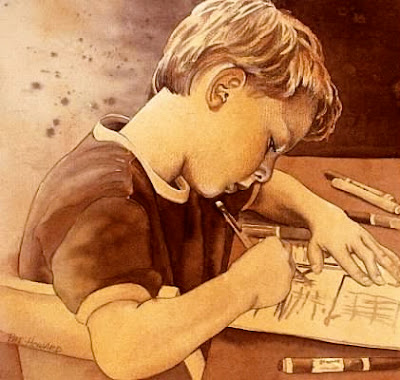
1)  SMALL, SQUARE, SEPIA-TONED PORTRAITS --


The above two portraits were painted on watercolor paper, and were each 12" x 12".


These next two portraits of Native Americans were painted on 8" x 8" Aquabord --


The following two portraits were painted on paper, with watercolor, and enhanced with watercolor pencils and charcoal . . . 


2)  MOSAIC PATTERN -- In these "Legs" paintings, the lower half of each painting is a field of colored squares, which looks like a tile mosaic pattern . . .


I've also super-imposed the grid pattern over the kids . . . 


The above two paintings are hanging in a Colorado hospital, in the pediatric ward; and the next three paintings are in a Fort Worth hospital . . . 


3)  LARGE BLOSSOMS on SMALL CRADLED AQUABORD SQUARES --


These square Aquabord panels are "cradled" (mounted on a wooden box).  They are about 2" deep, and the sides can be either painted or stained, so the paintings don't have to be matted and framed.


These little square paintings look great individually, or hung as a group, as above.


I sometimes continue the square theme in the background . . . 


4)  "PRISM" PAINTINGS -- The Grid is super-imposed on the subject.  It's painted realistically, but each square is a little different than the one next to it.  I like the contrast of the geometric shapes with the organic shapes. . . 


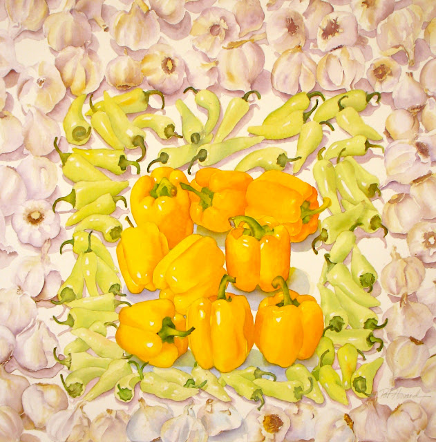
5) A SQUARE IN A SQUARE IN A SQUARE -- Inspired by Joseph Albers' Homage to the Square series of paintings.  Instead of square fields of color, I've implied the squares and filled them with veggies and fruit --


6) A SQUARE WITHIN A PATTERNED SQUARE FRAME -- 


 . . . and the pattern is also made up of squares.


Thursday, July 12, 2012

WATERCOLOR WORKSHOP: Painting a Checkerboard Abstraction

Using a checkerboard grid as the basic design, we'll create an abstract, but organized field of painted squares. . .


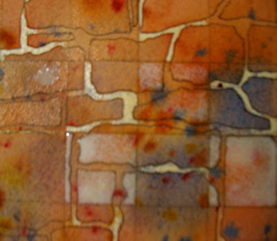
We will use the cracks of a stone wall as a jumping-off point for this design . . . 


For this project, you will need the following:  watercolor paper and brushes, masking fluid, a quill pen or toothpicks and Q-tips (for the masking fluid) . . . 


and four watercolor pigments (Quinacridone Burnt Orange, French Ultramarine Blue, Quinacridone Gold, and Permanent Alizarin Crimson). . . 


Begin by drawing a grid on your watercolor paper, with a pencil and a ruler, resulting in 7 squares across and 10 squares down. . . 


Now, either sit in front of a stone wall, or refer to the photograph above, and draw the cracks in the wall, with your pencil.  No shading -- just draw the contour of the cracks you see.  Ignore the grid -- just draw the cracks until you've covered your paper. . . 


Now, prepare your masking fluid.  In a small plastic container, pour in a little of the masking fluid.  Add water to the masking fluid and mix it up with a toothpick.  By watering it down, it makes the masking go on easier with a quill pen.  I like to use a quill pen, because you can peel off the masking from the metal nib after it dries.  

Draw the masking fluid on the cracks -- in EVERY OTHER SQUARE. . . 


Allow the masking fluid to totally dry before proceeding.

Now, prep your paints on your palette -- the French Ultramarine, Alizarin Crimson, Burnt Orange, and Quin Gold.  

Wet the entire painting with clear water, and drop in these four colors, in a random way, and let them mingle on their own. . . 


While this is still damp, spatter these same colors onto your painting (just dip your brush in the pigment and then tap your brush over the wet paint -- your brush should not touch the painting) . . . 


Now, let your painting dry, on a flat surface.


You will be doing some more masking, so be sure that your painting is completely dry.
Mix up some more masking fluid and water in your small plastic container.  

This time, apply the masking fluid to those squares that you skipped last time.  But, in those squares, instead of masking the cracks, you will MASK THE AREAS AROUND THE CRACKS . . . in EVERY OTHER SQUARE. . . 


When you have larger areas to cover with the masking, outline the shape with the quill pen, dipped in masking, and fill it in with a Q-tip dipped in masking.


So, each square is the opposite of the square next to it . . .  


Let this dry completely.  Meanwhile, mix up a few puddles of darks:  French Ultramarine + Burnt Orange; Burnt Orange + Alizarin Crimson; and, Alizarin Crimson + French Ultramarine . . . 


Now, WITHOUT wetting your paper first, start painting these darks on a diagonal, one at a time -- working your way down the paper.  When you switch colors, rinse out your brush quickly, pick up the next color, and start painting where you left off . . . 


While this is still wet, spatter some individual colors onto it -- Fr. Ultramarine, Aliz. Crimson, and Bt. Orange.  Now, let this dry completely.


Now, it's time to remove all the masking from your painting.  To do this, you can use a rubber cement pick-up eraser -- just rub it off gently.  If you don't have one of these erasers, you can use your thumb or a kneaded eraser.  


When you've picked up/ rubbed off all of the masking, rub your hand over the surface of the painting to make sure that you've gotten it all off.


You are almost, but not quite, finished.  

Mix up a pale wash of Quinacridone Gold -- lots of water with a little pigment.  Now, paint this wash over the outer squares only -- all the way around.  This is called "glazing" -- where you paint a pale wash over layers of dry paint.


OK -- NOW you're done!  Just sign, mat, and frame it -- it would look awesome with a big, wide white mat around it, in a simple black frame.