Thursday, June 14, 2012

WATERCOLOR WORKSHOP: Painting Lemons

Lemons are an ideal subject to study the color yellow.  In this project, we will be using different techniques to paint our lemons -- salt for texture, transparent layering, negative painting, and mingling.


To download a pdf of this tutorial, for $6, click here.


You'll need a few lemons for models and some salt (any kind will do).  I used 6 different pigments -- Aureolin Yellow, New Gamboge, Quinacridone Gold, Raw Sienna, Quinacridone Burnt Orange, and Quinacridone Magenta.


Do a pencil drawing of your lemons, and indicate a tabletop and some cast shadows . . . 


Now, prep two colors on your palette, to use for the first wash -- Aureolin Yellow (cool yellow) and New Gamboge (warm).  And, have some salt handy.  Wet each lemon separately, and then paint
these two yellows onto each lemon.  Allow some of the yellow to move into the shadow.  When there is just a sheen on your paper, sprinkle on some salt.  Do this for each lemon, and  let this dry completely


When this is totally dry, brush off the salt before proceeding.  Mix a light wash of Quinacridone Magenta (or something similar).  Paint the background with this wash, down to the tabletop.  Then paint the cast shadows with this wash.  Wet the area first with clear water and then paint the magenta.  Let this dry completely.


For your next layer, use the New Gamboge and Quinacridone Gold on the outside of the lemons.  Do each lemon separately again, wetting each one with clear water and dropping in the color.   Sprinkle some salt on this layer, too.  While this is drying, mix a less intense yellow, using Aureolin and a little Raw Sienna.  Use this to do some negative painting on the inside of the lemons.  Paint the triangles, leaving a sliver of "light" between the triangles and around the rim.


Brush off the salt after this is dry.  Now, add some form to the lemons by painting in a little burnt sienna (Quinacridone Burnt Orange).  Don't add salt to this layer. 


Now, mix a dark, using the Quin Burnt Orange and the Quin Magenta.  Use this mixture to add a few darks to the stem area of the middle lemon and to the part of the cast shadows, directly below the lemons.  Paint it onto dry paper, and then soften the edge with a damp brush.


Can't you just smell them?  Now, just slice your lemon into a glass of ice water, and enjoy!


To download a copy of this tutorial, in pdf form, for $6, click here.

Monday, June 11, 2012

TOP TEN: 10 Things Every Watercolorist Should Know About YELLOW

This week's theme is not-so-mellow YELLOW.

YELLOW is the color we associate with light and sunshine, daffodils and sunflowers, so it seemed like the perfect theme for the middle of June.


Here are 10 important things about the color YELLOW that I think everyone who paints in watercolor should know:


1)  YELLOW ATTRACTS THE EYE LIKE A MAGNET, so use yellow for cheery, optimistic, and spiritual paintings.  Yellow is sunny and bright, energizing and hopeful.  Yellow is upbeat (to Western minds, anyway) -- and is one of the primary colors in Native American art.


2)  YOU HAVE TO INTRODUCE ANOTHER COLOR TO YELLOW, TO DARKEN IT -- Yellow is an inherently light value.  Of all the colors, yellow reflects the greatest amount of light.  No matter how intense and saturated your yellow is, and no matter how many layers of yellow you paint on top of each other, it will not get much darker.  So, in order to get a darker value of yellow in a painting, you have to introduce another color, but still stay within the yellow family -- like quinacridone gold, burnt orange, burnt sienna, or raw sienna.


3)  YELLOW IS ONE OF THE THREE PRIMARY COLORS -- which means you can't mix two colors together to get yellow.  Yellow mixes with the other two primary colors to get secondary colors.  Yellow + Blue = Green.  Yellow + Red = Orange.  Good analogous color schemes for yellow in a painting are Yellow plus the Earth Colors, like Raw and Burnt Siennas; and Yellow plus its "Friendly Neighbors" (yellow-green and yellow-orange).


4)  ONCE YOU PUT A YELLOW WASH OVER A GRAPHITE PENCIL LINE, YOU CANNOT ERASE THE LINE.   (Just a heads up!)


5)  IF YOU WANT YOUR PAINTINGS TO HAVE A WARM GLOW, ALWAYS PAINT THE YELLOW FIRST, AS AN UNDERPAINTING.  Yellow will light up your painting like no other.   You can't make colors glow, just by using bright mixtures -- they need to be luminous.  Strive for a GLOW -- not intensity.  You can create this glow by underpainting with yellow first, and also by dropping yellow into other wet pigments.  It is best to use yellows as brilliantly and cleanly as possible.  An underpainting of yellow can establish the impression of sunshine.  And, any warm color (reds/greens/browns) could benefit from a yellow underpainting.


6)  YELLOW DOES NOT DO WELL ON TOP OF OTHER PIGMENTS.  Even though yellow is the lightest and most delicate color, it becomes opaque and loses its luminosity when painted over other pigments.  So, in watercolor, you should not glaze yellow over another color in order to try to get a lighter or brighter color.  Adding yellow on top will not increase the glow.  It just becomes opaque, because the light cannot penetrate through to the paper.


7)  PUT YELLOW NEXT TO ITS COMPLEMENT, VIOLET; BUT, DO NOT MIX THESE TWO COMPLEMENTS TOGETHER.  The Yellow/Violet harmony is exotic, beautiful and bright, when placed side by side (some irises have this combination, as well as violets, columbine, and some sunsets).  But, they are not very pretty when mixed together -- you get a muddy color.


8)  HAVE A WARM AND A COOL VERSION OF YELLOW ON YOUR PALETTE.  Color temperature is relative.  When we're talking about the entire color wheel or the whole color spectrum, the warm colors are the yellows/oranges/reds -- the colors of sunlight and fire.  But, when we're talking about the yellow color family, it is good to have a cool yellow, like Aureolin Yellow or Winsor Yellow.  They have the greatest mixing potential -- making beautiful greens and vibrant oranges, and are also effective as underpaintings.  Your warm yellow could be New Gamboge or Cadmium Yellow, which are warm, intense yellows, and good to use as underpaintings for reds/oranges/browns.


9)  DON'T USE LEMON YELLOW.  (That's my opinion, and I'm sticking to it.)  It is not intense or saturated/pure enough for a yellow.  And, because it has white in it, it is not transparent, and any color it is mixed with, will tend to look "chalky".  If you want a light color of yellow, just add more water to your cool yellow (Aureolin or Winsor).


10)  QUINACRIDONE GOLD IS HEAVEN IN A TUBE!  Okay, that might be an exaggeration, but it is a very powerful, brilliant, transparent color.  It's beautiful on its own, but it is also great for darkening other yellows without muddying them.  Raw Sienna is another useful color, for glazing over an area to reduce its intensity. Because it is an unsaturated (duller) yellow, it has reduced mixing potential.


Friday, June 8, 2012

WATERCOLOR WORKSHOP: Values 1st/ Color 2nd -- Painting a Red Apple

Here's one approach to a painting, for you to try with a red apple:

1) Draw and paint a value painting first;

then,

2)  Paint transparent color glazes on top of the value painting.

This way, you get the 3-dimensional form first, without having to worry about the color.


Start with a simple drawing of an apple, and also indicate a cast shadow, a highlight, and the line for a tabletop . . . 


Mix a red-violet wash, using Quinacridone Magenta and French Ultramarine (or something similar).  Using that mixture, paint the apple and the tabletop, leaving the highlight and the top 1/2 of the background white. . . (this does not have to be an even wash, and you can wet the area first, to get a more uneven wash, like I did).


After that is dry, using the same mixture, paint the cast shadow and parts of the apple . . . 


Now, mix up a darker purple, and paint just a few parts of the apple, and part of the cast shadow, softening the edges with a damp brush.


You now have a 3-dimensional form that should resemble an apple . . . but it's begging for some color!

Clean the purple off your palette, and prep three warm colors -- a yellow, a warm red (Windsor Red or Cadmium Red), and a cool red (like Permanent Alizarin Crimson).


Now, do a mingling of these colors on your apple, right on top of the value painting.  Start painting the yellow on the parts of your apple that are the lightest value, then switch to the warm red, then finish with the cool red.  You can wet the apple first, and then add the colors, if that is easier.


You can see how I brought some of the red into the cast shadow, for reflected light.


When this is dry, you may want to glaze over the apple again with a red wash, since red tends to lose its brightness somewhat as it dries.


I'm sad that I covered up all the nice warm yellow in the middle -- so, if you can keep from doing the same thing, you will probably like it better.  


To finish your apple, mix a dark purple again, and hit just a few spots on the apple and stem, as well as a small sliver (not an outline, just a small dark shape under the apple.  Be careful that your cast shadow isn't a solid dark color; otherwise, it will look like a hole that your apple is about to fall into.


Now, try the opposite approach to painting an apple, by painting the color first, and then add the values -- see which way works the best for you.


Tuesday, June 5, 2012

WATERCOLOR WORKSHOP: Painting Values with Layered Washes

In this simple project, we will be LAYERING gray washes to build up VALUES, from light to dark.  We will also learn how to achieve ATMOSPHERIC PERSPECTIVE, through these value changes . . .


Atmospheric perspective refers to the effect the atmosphere has on the appearance of objects (in this case, mountains), as they are viewed from a distance.  This effect tends to make the mountains, or hills, take on a lighter and lighter value as their distance increases. 


With watercolor, we can achieve this effect by layering washes, in order to build up to the dark values gradually.

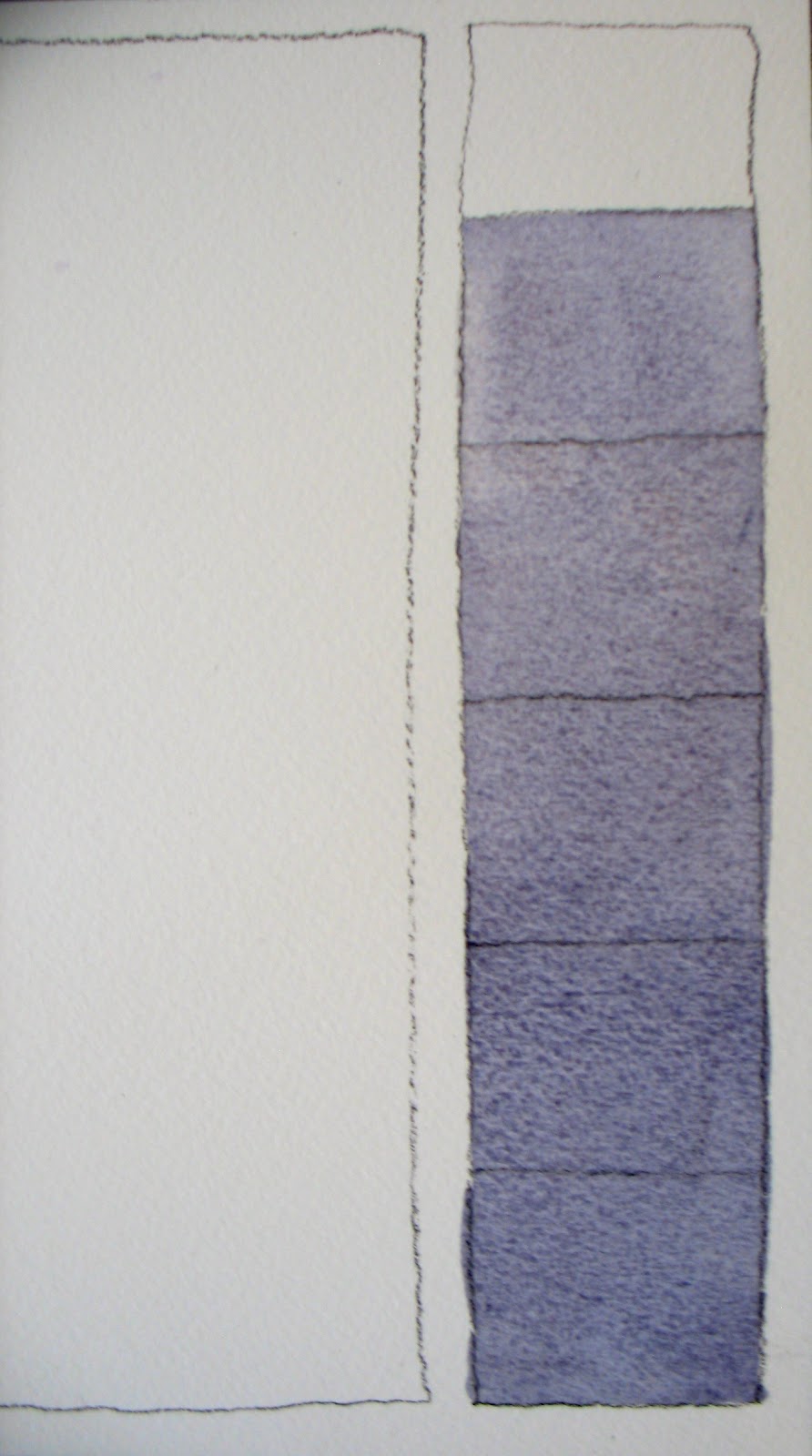
Start out by drawing two rectangles (freehand) on your watercolor paper.  The skinny rectangle down the right-hand side of the paper will become a value scale. . . 


Now mix a GRAY, using French Ultramarine and Burnt Sienna.  I like to mix my grays instead of using a gray from a tube, because the result is much more interesting.  Once you have the gray color you like, add enough water to it to make a very light version of it.  Make sure you have enough to cover the entire big rectangle and most of the skinny one.  


With this light gray wash, paint all of the skinny rectangle, except for the top square. . . 


Before proceeding, make sure you have a tissue handy.  No, I'm not going to make you cry . . . we're going to create clouds with it.

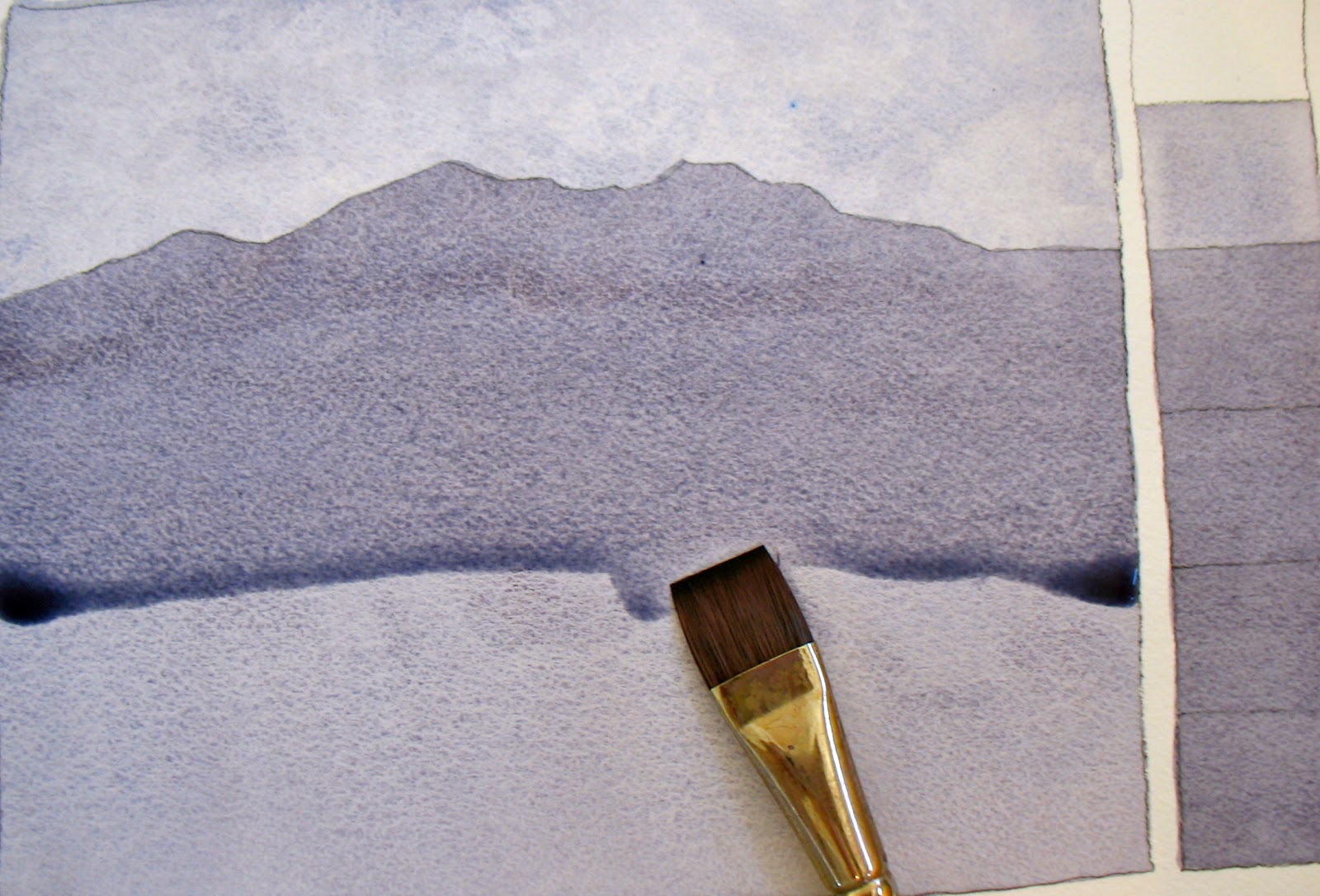
Now, paint the entire big rectangle with this light wash.  When painting a wash onto dry paper, it's helpful to have your paper/board at a slight tilt.  

While this is still wet, lay your board flat, take a piece of the tissue, and roll it across the top of the paper. . . you can do this more than once . . . 


Let this wash dry completely.


Now, draw the furthest mountain ridge with pencil.  Using the same wash mixture, first paint the value scale, starting with the 3rd box from the top -- all the way to the bottom.  Next, paint this light gray wash from the pencil line (the mountain ridge) down -- to the bottom of the rectangle.  Remember to have your board tilted, so that gravity helps you keep a "bead" at the bottom of your wash.  Each time you pick up more paint on your brush and come back to the paper, you will only touch this bead of paint, while you work your way down to the bottom.  Don't go back to what you've already painted.


Let this layer dry completely.  If necessary, you can use a hair dryer after each layer.


At this point, you'll need to mix some more gray, using the same two colors.  You can make this wash a little darker -- a medium value gray.  With this mixture, paint the value scale, starting with the 4th box down, and paint all the way to the bottom.  Then, draw another pencil line, depicting a closer mountain range.  Paint this wash from the pencil line down to the bottom of the paper.


Now, make your wash stronger by adding more pigment.  Add another pencil line -- tree-lined hills.  No details, just indicate by the edge that these are trees.  Then, paint the bottom two squares of the value scale with this stronger wash, and then paint from the pencil line down to the bottom of the paper.  If, after painting this, you feel that you haven't made the wash a dark enough value -- dry your paper with a hair dryer, and paint it again with the same wash.


Add enough pigment to your wash to make your darkest dark -- almost black.  Paint your last box black.  Draw the top of a hill in the foreground, and paint it black.


 . . . and you're finished!  You can see how we've succeeded, through the use of a full range of values -- from light to dark -- to get a sense of depth in our painting.  

Monday, June 4, 2012

VALUES: 10 Sketchbook Exercises to Try

In drawing and painting, the impression of form and light is conveyed by values.  Values are the many different shades, or tones, between white and black.

Try a few, or all, of these "values" exercises in your sketchbook.  I've included examples from my own sketchbooks . . .

1)  Draw some DRAPERY, or draped fabric -- Use charcoal, charcoal pencil, or a very soft drawing pencil (6B). Try to have at least four values in your drawing -- lightest (the white of your paper), a light medium gray, a darker medium gray, and a black. . .


2)  Draw some machinery, or a train, a bike, or a car -- in ink.  Then mix up some ink washes -- 3 different strengths (just put a little India ink in a Dixie Cup and add a little water).  Then, paint your values.  Leave the paper white in some places, for your lightest light. . . 


3)  OK, it's time for something simple -- a shiny, red apple!  Set your apple on a white piece of paper, have a strong light source, so you can see a good cast shadow.  Now, draw your apple with a pencil.


4)  Now, do a value painting of a face.  Draw the face lightly in pencil, from a photo or from life.  (If you're going to draw or paint kids from life, wait until they're sleeping -- they don't move and they always look so sweet :)  Then, mix up a light gray on your palette (French Ultramarine mixed with Burnt Sienna makes a nice gray).  Use that mixture to paint your values, leaving the white of your paper for your lightest light . . . 


5)  Draw a landscape with some trees, a building, and a figure.  Simplify this into two categories of shapes -- sunlit and shadow.  Leave all the sunlit shapes white.  Create a middle value in the shadow shapes by cross-hatching with the pen. . . 


6)  Set up a simple still life in your kitchen.  Do a simple pencil drawing -- then, paint a monochromatic value painting, with burnt sienna washes.  Try to have 4 or 5 different values. . . 


7)  Set up another simple still life on a patterned surface.  Do a few small value sketches, rendering your values in different ways.  One, draw your sketch entirely in pencil. Another, use pencil and ink -- the white of the paper for the lightest light, the pencil for the grays, and the ink for the black. . . 


8)  Set up another very simple still life -- just 2 objects -- like a piece of fruit and a bottle.  Use a pencil for the entire drawing. . . 


9)  Now, using a ball-point pen, draw a houseplant or a bowl of fruit.  Use cross-hatching for the mid-values and untouched paper for the lightest value.  The denser the cross-hatch, the darker it looks . . . 


10)  For the last exercise -- draw a simple egg.  Not as simple as it should be.  For this drawing, use charcoal, charcoal pencil, or a soft pencil (6B).   I once had a drawing teacher who wanted us to draw a dozen eggs and we weren't allowed to use any lines.  I'm not that hard-core . . . 


Any of these drawings could be developed later into a painting.  It's good to have a value plan, before you add color into the equation.

Sunday, June 3, 2012

Theme for the Week: VALUES

The theme for this next week is VALUES -- and, no, I won't be preaching about moral values or family values, and I won't be talking about monetary value -- or any sort of qualitative value.

I will be talking about VALUE, in the context of drawing and painting. VALUE is a design element that is much underestimated . . .


VALUE refers to the lightness or darkness of a color.  In most paintings or drawings, a minimum of three values are used -- light, medium, and dark.  

VALUE is also the main means of creating dimension on a flat piece of paper.  VALUE changes establish an object's form and can also suggest the direction of light in a painting.

So, I hope this next week will be of VALUE to all of you!


Saturday, June 2, 2012

ONE-DAY WATERCOLOR WORKSHOP: Painting Flowers on Aquabord

If you live in or near Durango, CO -- join me at my home & studio for this 3-1/2 hour workshop 
on Wednesday, June 20, 2012 . . .


You will learn how to paint flowers on Aquabord -- a unique surface for your watercolor painting.
I will provide a small Aquabord panel for each of you, as well as the liquid acrylic that we will use for the drawing.  You just need to bring your normal watercolor paints, palette, and brushes . . . and a small box of Q-tips for the "un-painting".  

Choose either the daytime or evening 3-1/2 hour session.  The price is only $60. 
E-mail me (Pat Howard), at howard@frontier.net, for more info or to sign up.