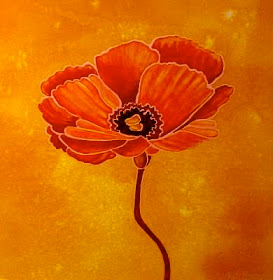
"Orange is the happiest color." - Frank Sinatra
It seems like the perfect time of year to concentrate on the color ORANGE -- when the greens in nature are turning to golds and oranges; when the farmers' markets are filled with pumpkins, orangey-red apples, and yellow-orange gourds and squashes; and, when the Denver Broncos, with their orange and blue uniforms, start their season. (Sorry -- I'm a football fan!)
Fun and flamboyant ORANGE radiates warmth and energy -- and is epitomized by the glow of the setting sun, the flames of a campfire, fall foliage, and it's namesake citrus fruit.
Here are 10 things that I think every watercolorist should know about this color, along with 10 "orange" paintings of mine, and 10 quotes about the color orange:
1. ORANGE sparks more controversy than any other hue. There is usually a strong positive or a strong negative association to this color. But, certain tones of orange, like terra cotta, peach, coral, and rust, have a broader appeal than a true orange.
"Everyone knows that Yellow, Orange, and Red suggest ideas of joy and plenty. I can paint you the skin of Venus with mud, provided you let me surround it as I will." - Eugene Delacroix
2. ORANGE is a secondary color, made up of Red and Yellow. And so, it is very vibrant and shares attributes of both Red and Yellow. All three colors are very useful in autumn landscapes.
"Reds, Yellows, and Oranges conjure up sunlight and fire, while the Blues and Blue-Greens evoke snow and ice, sea, sky, and moonlight." - Anonymous
3. You don't need a tube ORANGE on your palette, since it is easy to mix an Orange with any Red and Yellow. You can mix many different shades, between Red-Orange and Yellow-Orange. And, many of the tube Oranges are not lightfast, so I always mix my oranges. A really beautiful orange is made with New Gamboge and Quinacridone Rose. I even use that mixture, watered down, for flesh color in my portraits. You can try a color exercise grid, to see all the various Oranges that you can mix -- with your Reds across the top and Yellows down the side.
"I can see the orange haze on the horizon, as the morning exhales a yawn,
and seems to be ready to rise". - Jeb Dickerson
4. An invaluable "ORANGE", that you should have on your palette, is Quinacridone Burnt Orange -- which is similar to Burnt Sienna, but is very transparent and mixes well. It is more transparent and intensely-colored than the earth pigment, Burnt Sienna. And, it's especially good to use when you need a brown, other than in a landscape.
" . . . Frizzy Orange curls grow in her wild hair, like snapdragons pleading for water." - Paul Gardner
5. The shades of Burnt Sienna -- still a tried and true color -- vary considerably, from brand to brand. This natural, unsaturated Orange "earth" color, is originally from Sienna in Italy. It is great for landscapes, and the appropriate blue for the sky, when using Burnt Sienna, is Cerulean Blue.
"There is no Blue, without Yellow and without Orange." - Vincent Van Gogh
6. The complement of ORANGE is Blue. When placed right next to each other, they really pop. Mix them into each other to create Browns. Orange and French Ultramarine, especially, make colorful neutrals.
"Who in the rainbow can draw the line where the violet tint ends and the orange tint begins?
Distinctly we see the difference of the colors, but where exactly does the one first blindingly enter into the other? So with sanity and insanity." - Herman Melville
7. A very versatile and effective complementary color combo is Quinacridone Burnt Orange and French Ultramarine. This is a good 2-color scheme, especially for landscapes. When mixed together, these two colors make a lovely gray (somewhat like Payne's Gray). When your painting is mostly Orange, the French Ultramarine can be added to make a nice dark.
"Orange is Red brought nearer to humanity by Yellow." - Wassily Kandinsky
8. ORANGE is a warm color, that visually comes forward. It can have an exciting effect in a painting. Orange is one of those colors that really stands out, even in the distance, as if to shout, "Hey, look at me!"
"My mum taught me that redheads shouldn't wear Pink, Red, or Orange, but if you choose the right shade, such as a Bright Orange or a Cherry Red, it can look fabulous." - Jane Asher
9. One good use for a Cadmium ORANGE is to spatter it on top of a very dark wash. Because it's heavy, it will just settle and add some interest to a big field of dark color. But, never just glaze a Cadmium Orange wash over a dark wash.
"The majority of painters, because they aren't colorists, do not see Yellow, Orange, or sulphur in the South of France, and they call a painter mad if he sees with eyes other than theirs." - V. Van Gogh
10. ORANGE is the new Black. I don't know what that means, but it's the name of a popular new TV show on Netflix. I thought you should know that :)


