Absolute green is the most restful color, lacking any undertone of joy, grief, or passion.
- Wassily Kandinsky
 |
| "Water Lilies on Lake Eileen", watercolor by Pat Howard |
Green is the pervasive color in nature -- we see it everywhere. The natural greens, from forest to lime, are seen as tranquil and refreshing. Green is the color of peace and ecology -- in fact, it is synonymous with ecology.
Here are 10 things that I think every watercolorist should know about Green, along with some quotes by others and some "green" paintings of mine:
1. The Greens in nature are extremely varied, ranging from yellowish green of a fresh Boston lettuce, to the khaki green of a late summer tree, to the blue-green of a Colorado Blue Spruce.
When you encounter a forest landscape, your first impression is that it is entirely green. But, if you really look -- really see it -- you will find that it contains many other color jewels, hidden within.
The color harmonies of green mostly mark two of the seasons -- spring and summer. Think of spring's bright greens and yellow-greens, and summer's lush deep greens and blue-greens. The color of grass and leaves are constantly transformed by light and shadow, too.
_________________________________________________________________
Green is the prime color of the world, and that from which its loveliness arises.
- Pedro Calderon de la Barca
 |
| "White Lilies", watercolor by Pat Howard |
2 - Natural greens are predominantly warm, so yellows and reds need to be included in your green mixtures. Greens are challenging, but they can be beautiful, can look natural, and can even be transparent.
Don't be afraid to use greens, and don't use the same boring green everywhere. Try to use a colorful blend of green mixtures and tube greens. For colorful greens, mix yellow and green together first, then naturalize the mix with a small amount of rose.
_______________________________________________________________________________
He had that curious love of green, which in individuals is always the sign of a subtle artistic temperament, and in nations, is said to denote a laxity, if not a decadence, of morals.
- Oscar Wilde
5 -- Permanent Sap Green -- warm and transparent, nongranulating and nonstaining -- is a good choice of green for your palette. A basic transparent green mixture is Sap Green + Aureolin Yellow. Then add a touch of Rose for a natural landscape green which stays transparent. You can neutralize Sap Green with a Rose or a Red, for a bronzy green. Sap Green + Quinacridone Rose makes a nice gray-green.
3 - Use both tube Greens and mixed Greens, but always add another color to your tube greens. Many artists mix their greens instead of finding the correct color in a tube for convenience. And, certain pigments, like Winsor (Phthalo) Green, is way too bright, overpowering, and unnatural to use alone. You may be better off mingling yellows and blues to get the greens you want; however, you can also use tube greens, like Sap Green, and add other colors to it.
A helpful exercise for you to do is a mixing exercise. Make a grid on watercolor paper. Label and put all your yellows across the top (including Quinacridone Gold and Raw Sienna). Then, put all your blues and your tube greens down the side. Paint the yellows first, and when those strips are dry, paint the blues and greens, keeping those strips transparent, so you can see what greens your paints will produce.
____________________________________________________________________________
There are colors that seem impossible. The color of the grass that moves and the bottom of the water, for example." - Claude Monet
4 -- Winsor Green (Phthalo/Thalo Green) is an unnatural color with a strange, blue tinge, but it can still be a useful color for your palette. Phthalo Green is a cool, staining, transparent color, primarily used for mixing darks. Use Phthalo (Winsor) Green + Alizarin Crimson for your darkest greens. If you add equal parts Winsor Green and Alizarin Crimson, it becomes a beautiful black.
For rich, dark greens, start with Phthalo Green, and add a yellow to it, to get a very transparent dark. If this green mixture is too vibrant and unnatural, it can be tamed with a bit of Quinacridone Rose or Quinacridone Burnt Orange (either added to the mixture, or glazed on top). So, a nice yellow-green can be made with Phthalo Green + Aureolin Yellow, and a touch of Quinacridone Rose, to make it more natural. Mix the Phthalo Green and the Aureolin Yellow together first (you'll need more yellow than green in this mix); then, add the Rose.
Try creating different dark greens, starting with Winsor Green, and adding various yellows. These mixed greens will be less harsh and more varied than using Winsor/Phthalo Green right out of the tube.
____________________________________________
The greens of these trees these leaves
The many shades of green.
- Shalom Freedman
 |
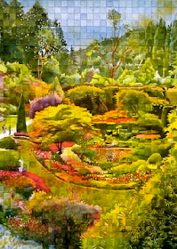
| "Butchart Gardens", watercolor by Pat Howard |
5 -- Permanent Sap Green -- warm and transparent, nongranulating and nonstaining -- is a good choice of green for your palette. A basic transparent green mixture is Sap Green + Aureolin Yellow. Then add a touch of Rose for a natural landscape green which stays transparent. You can neutralize Sap Green with a Rose or a Red, for a bronzy green. Sap Green + Quinacridone Rose makes a nice gray-green.
___________________________________________________________________________
9 - Using an analogous color scheme in a nature painting breaks up the monotony of green and creates excitement in your painting. Start with the main object's local color (green) and build an analogous color scheme around that. (Remember that analogous colors are next to each other on the color wheel.
Artificial green in the brain, but so green in ideas . . . .
- Nyein Way
6 - Some suggestions for mixing Greens for landscapes:
- Mingle Sap Green with Ultramarine Blue for middle value foliage or foliage in shadows.
- Mingle Sap Green with Quinacridone Rose to gray down foliage a little.
- Mingle Sap Green with Cobalt Blue and Quinacridone Gold for grass in sunlight.
- Mingle Sap Green with Quin. Burnt Orange and Phthalo Blue for an intense dark green.
- Mix Sap Green + Raw Sienna + Cobalt Blue for a gray-green.
- Don't use Yellow Ochre in a green mixture -- too opaque, so it's not luminous.
- Don't add a 4th pigment to any mixture -- that's when your greens will get muddy and opaque.
- Whenever your green mixture is too vibrant or unnatural for a landscape, it can be tamed with a bit of Rose or Burnt Sienna, (either added to the mixture, or glazed on top).
_______________________________________________________________________________
The first colors that made a strong impression on me were bright, juicy Green, White, Carmine Red, Black, and Yellow Ochre. These memories go back to the third year of my life.
- Wassily Kandinsky
7 - Remember that your warm greens will come forward, visually. Try making your distant greens slightly grayer and cooler (bluer).
To make your foreground foliage brighter and warmer, mix some yellow and burnt orange into your greens. Distant trees should be cooler and a little grayer, so add more blue into the mix.
In fact, underpaint the foreground with a warm yellow and the background with a light blue, before painting any greens.
______________________________________________________________
Green, Green, you are so glorious green.
An abundance of beautiful green,
not coloured, but just natural and kind.
Makes me wonder how your creation
of green came to life . . .
- Premila Patel
8 - Green and Red are the warmest of the complements, and so, the most cheerful! Evenly matched partners (since they are both warm and both of a middle value) -- setting up a vibration when they touch, like optical glitter.
In even the most abstract art, Green reminds us of nature's greenery, and Red reminds us of its flowers.
If your green is overly bright, use a transparent glaze of Quinacridone Rose over it, to cut the intensity.
If you have a bright red in the background that needs to be calmed down -- use a very, very light glaze of Winsor Green over it.
Make your tree trunks reddish brown to make the leaves of the trees look brighter.
____________________________________________________________________________
Of Greens seen in the country, that of trees and shrubs will appear darker than the Green of the fields or meadows. - Leonardo Da Vinci
 |
| "The Three Graces", watercolor by Pat Howard |
9 - Using an analogous color scheme in a nature painting breaks up the monotony of green and creates excitement in your painting. Start with the main object's local color (green) and build an analogous color scheme around that. (Remember that analogous colors are next to each other on the color wheel.
Since the local color of leaves is green, use more yellow in the areas closest to the light source and more blues in the shadows.
Use analogous greens and yellows to dominate in a nature painting, with a touch of reddish brown added for contrast. (That is a foolproof color combo!)
______________________________________________________________________________
Yosemite Valley, to me, is always a sunrise, a glitter of Green and golden wonder in a vast edifice of stone and space. - Ansel Adams
10 - Try some "Optical Mixing", with yellow and blue -- where juxtaposed colors are blended by the viewer's eye. This is called Pointillism, and was used by Georges Seurat, a Post-Impressionist artist. To paint a large grassy area, he painted an undertone of green, and then built up areas of light and shadow, using dots of yellow, orange, violet, and blue. This would be a good way to add some variety to a big area of green in your painting.
____________________________________________________


