Pages

Tuesday, February 26, 2013

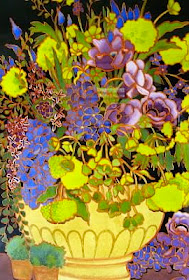
DOODLING: Just Do it! It's Good for You!


Is Doodling an art form?  And, do we care?

Most people think of Doodling as mindless scribbling -- in the margins of our notebooks, or while talking on the phone.

But, Doodling is so much more than that.


Doodles may be shapes, patterns, scribbles, whimsical cartoons, or elaborate drawings.

Doodles seem to take shape of their own accord -- as if they have a life of their own.


A few American presidents -- including Thomas Jefferson, Ronald Reagan, and Bill Clinton -- have been known to doodle during meetings.


According to at least one scientific study, Doodling can aid a person's memory, by expending just enough energy to keep one from daydreaming or not paying attention.

This simple act of Doodling can help us think, remember, and learn.  Some people doodle in order to visualize the ideas in their heads.


Most importantly, Doodling is fun, and you can't make a mistake -- it's a form of self-expression that is accessible for anyone.

Comedian Larry David, in HBO's "Curb Your Enthusiasm" said, "I can't draw to save my life, but yet, I'm a very good doodler".


I know that Doodling will improve your drawing and design skills.  And, the more you doodle, your unique style will start to come through.

It's amazing how creative you can be without even trying.  Doodles can also be turned into beautiful works of art . . . or, just stay happily in the margins of your notebooks.


For the past month, I have been drawing "Daily Doodles" -- mostly of flowers and fruit.  Well, they started out as "daily", when I was doing them in pencil or ink, only.

But, then I began to add borders and then color, making them more elaborate -- and time-consuming.  I still love doing them, but now I call them my "Super Doodles".  I do about 3 per week, instead of daily.  


I intend to take some of these Doodles and develop them into larger watercolor paintings.  The "Doodle" will then become a step in the painting process, instead of an end in itself.  I will keep you informed of these works-in-progress, and will also show some step-by-step tutorials.


I am currently offering matted prints of some of my favorite Doodles in my new Etsy shop,


To check it out, click the link above, or click the "SHOP" tag at the top of my blog.  I will be adding more items to the shop in the weeks ahead.


Try your hand at some Doodling in your own sketchbook, if you haven't done that in awhile.  Start with some scribbles and repetitive shapes, in pencil or ink.  

Start small in the middle of a sketchbook page, and build your pattern out from there.  Don't stop until you get to the edge of your paper.  Then, go back and draw some shapes within shapes -- circles, squares, continuous meandering lines, spirals, squiggles, dots, zigzags . . . 


Tuesday, February 19, 2013

BEHIND-THE-SCENES: New Watercolor Portrait


I just completed and shipped my latest watercolor portrait.  He is the grandson of a friend of mine from high school, and she commissioned me to paint his portrait.  It was fun -- I love doing these "action shot" portraits.

Here is the finished 16"x 12" portrait -- "Andrew After the Goal" . . .


Here is a slideshow of the painting process . . . (to music, of course).


Sunday, February 17, 2013

PURPLE/VIOLET: At Least 10 Things Every Watercolorist Should Know About This Color


"I think it pisses God off if you walk by the color Purple in a field somewhere, and don't notice it."
                                                                                                              -- Alice Walker

watercolor by Pat Howard

1 -- Violet is one of the secondary colors, along with Orange and Green.  A secondary color is created by mixing together two of the primaries, (in this case, Blue and Red).


"But, luckily, he kept his wits and his Purple crayon." 
 - Crockett Johnson, from Harold and the Purple Crayon

watercolor on Aquabord, by Pat Howard


2 -- In its darkest values (like Eggplant), Purple is rich, dramatic, and sophisticated.  For a rich, dark Purple, start with Alizarin Crimson and add French Ultramarine.  This looks beautiful next to a golden glow.  

Lighter shades of Purple, like Lavender and Lilac, bring a more restful quality to a painting.

Purple embodies the balance of Red stimulation and Blue calm.


"Womanist is to Feminist
as Purple is to Lavender."
- Alice Walker

watercolor by Pat Howard


3 -- The complementary color of Violet is Yellow.  The Violet/Yellow harmony can be summed up in a single word -- exotic!  This Violet/Yellow chord has little connection with everyday experience -- except in irises and violets, rare butterflies, tropical birds, and amazing sunsets.


"Who in the rainbow can draw the line where the Violet tint ends and the Orange tint begins?  Distinctly, we see the difference of the colors, but where exactly does the one first blindingly enter into the other?"          --  Herman Melville


watercolor by Pat Howard


4 -- The Secondary Triad -- Violet/Orange/Green -- is a wonderful, and very powerful, color scheme.  This is one of my favorites!


"Everything about Florence seems to be colored with a mild Violet, like diluted wine."
                                                                                                                    -- Henry James

watercolor by Pat Howard


5 -- I prefer to mix Purples from the Reds and Blues on my palette, rather than using tube Violets.  The results are Violets that are glowing, alive, and contain enormous strength.  


"Roses are red, That much is true;
But Violets are Purple, Not fucking Blue."
                     -- unknown

watercolor by Pat Howard


6 -- To mix high-intensity Violets -- Use cool Reds, like Quinacridone Rose, or Alizarin Crimson, or Quinacridone Magenta; and, mix with a warm Blue, like French Ultramarine.


"Deep Violets, you liken to the kindest eyes, That look on you without a thought disloyal."
                                                                                                     -- Elizabeth Barrett Browning

watercolor by Pat Howard


7 -- Use the Red-Violet hues for a warm color scheme and the Blue-Violets, for a more somber, cool scheme.  Lavender suggests the feminine, and dark Purple (Eggplant) can suggest the masculine.

In stained glass, the color Purple, or Violet, is seen as the uniting of the "wisdom" of Blue and the "love" of Red, and symbolizes justice and royalty.


"The Mediterranean has the color of mackerel, changeable, I mean.  You don't always know if it is Green or Violet.  You can't even say it's Blue."                    - Vincent Van Gogh


watercolor by Pat Howard


8 -- Purple is regal, wise, and spiritual.  As a complement to Yellow-Green, it's a good color for spring landscapes or still lives.  Try adding a few spots of Purple/Violet here and there.  

In fact, Purple is an ideal color to enhance or enliven almost any painting subject, including mountains and winter scenes.  These provide a great opportunity to use Violets.  Long shadows on snow have shades of Pinks and Blues in them.  And, a rainy day can have a Blue-Violet tinge -- even a sky can look Purple.


"Don't order any Black things.  Rejoice in his memory, and be radiant; leave grief to the children.  Wear Violet or Purple."                                                                             - George Bernard Shaw

watercolor by Pat Howard


9 -- Try doing a "Paint Shadows First" painting -- where you do a value painting, using Violet.  Then, after getting the values (the lights and darks) right, you glaze color over it.  Push the underpainting to Red-Violet for the warms and to Blue-Violet for the cools.


"Inside, the cathedral is a Gothic forest, dappled in Violet twilight and vast with quiet."
                                                                                                                    - Wendy Insinger

watercolor by Pat Howard


10 - Some perfect color combos for Purples/Violets/Lilacs/Lavenders --
            - French Ultramarine + Quinacridone Rose
            - Cobalt Blue + Quinacridone Rose
            - Alizarin Crimson + Cobalt Blue
            - French Ultramarine + Alizarin Crimson
            - Quinacridone Magenta + French Ultramarine
            - Quinacridone Magenta + Cobalt Blue
            - Phthalo Blue + Quinacridone Magenta
            - Phthalo Blue + Alizarin Crimson
            - Cobalt Blue + Quinacridone Rose + Quin. Burnt Orange
            - Quinacridone Rose + Phthalo Blue

If you feel you must have a tube Violet on your palette, there are many to choose from -- Winsor Violet, Cobalt Violet, Mineral Violet, Quinacridone Violet.  But, try to use some of the above combinations, as well -- for brilliance and variety.


Since February is the month associated with the color Purple, this is a great time to mix up some new shades and use them in your paintings.  


Monday, February 11, 2013

WATERCOLOR WORKSHOP: Painting Cosmos on Aquabord

For a change of pace, try painting with watercolor on a surface called Aquabord.  There are advantages and disadvantages of using this surface.  One of the advantages is the ability to lift paint easily -- this is also one of the disadvantages, especially when you try to layer glazes.

Some watercolorists love it, and some hate it.  Give it a try to see which you are.

Follow along with me in this step-by-step project -- painting "Dancing Petticoat" Cosmos on Aquabord --


For this project, you'll need a panel of Aquabord, your watercolors and brushes, and some liquid acrylic for the lines . . . 


Now, find some photo references for your Cosmos . . . or use mine!  I first found this photo of some cosmos in a field . . . 


I then drew a "doodle" in ink and markers, using this photo reference . . . 


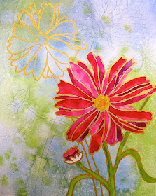
I used this doodle as reference for the painting on the Aquabord.   First, do a wet-in-wet painting on the Aquabord, in blues and greens.  Spatter some paint on this, and mist with a little water, to get some texture.  This will be your background.  When this is dry, draw the biggest flower with its stem and leaves.  Then, using some liquid acrylic (in this case, gold), go over your pencil lines . . .  


Now, for the "un-painting", where you lift the color out of the petals . . . 


Using a wet Q-tip, wet each petal, and then lift out the color with a dry Q-tip . . .


After you've lifted out the color from all the petals, paint each petal with pinks, reds, roses, and magentas . . . 


Vary the color from petal to petal . . . 


Paint the middle of the flower gold, and the stems and leaves green.  Just get the paint on there and don't fuss with it too much.  The paint goes on much differently than it does on paper. . . 


Finish your drawing in pencil, and paint over the pencil lines of the second flower, with the gold acrylic. . . 


Now do your "un-painting" with the Q-tips . . . 


Paint these petals with your pinks, reds, roses, and magentas, varying the color with each petal . . . 


Now, paint the stem a darker (and bluer) green, and the middle a goldish yellow . . . 


Paint over the rest of the pencil lines with the liquid acrylic.  (When you're finished with all the lines, be sure to wash out your brush really well, otherwise you'll never be able to use it again . . . )


Lift out the color from the remaining flowers -- no need to lift the color from the stems and leaves . . . 


Paint the petals in a variety of reds and roses, with gold in the middle . . . 


Paint the remaining leaves and stems with a somewhat darker green.  Add a little blue to Sap Green, or mix a blue with quinacridone gold for a darker green. . . 


And, you're finished!  Just need to sign it, and spray with a fixative and then a spray varnish . . . 


Monday, February 4, 2013

PHOTO-A-DAY CHALLENGE: January Pix & February Challenge Themes

Here are the rest of my photos from the January Challenge:

Day 20 --


"FUZZY FACE"


Day 21 -- 


"WARMTH"


Day 22 -- 


"TODAY'S FAVORITE THINGS"


Day 23 --


"TEXTURES OF WINTER"


DAY 24 -- 


"BIRTHDAY BONE"


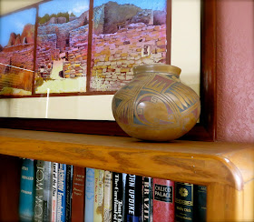
Day 28 --


"ON THE SHELF"


Day 31 --


"REFLECTION"

That's it for January . . . 

 . . . let's keep it going.  Here are the themes for February:


Try it!  Even if you never post any of your photos -- even if you don't think of yourself as a photographer -- even if you don't have a camera (use your phone).  It's kind of fun.