Pages

Tuesday, December 11, 2012

GETTING STARTED IN WATERCOLOR: BASIC COLOR PALETTE

If you are just beginning to paint in watercolor, you will want to get off on the right foot by choosing the right paint for your palette.  And, if you've been painting for awhile, you might just want to start a new palette with new paint, every now and then.


QUALITY -- I am definitely an advocate of using good supplies -- especially good paint!  Please don't sacrifice quality for the sake of economy.  I know!  Watercolor pigments are expensive, but consider how long they last.  Watercolor pigments are used up at a much slower rate than oil or acrylic colors.  So, don't worry -- you won't be racing through your tubes of paint as you might in an oil painting class.  With proper care, your paints will last a long time, which makes them economical to use after all.  Scrimping on paints is generally not worth it.

As a child, you probably played with watercolors -- most likely using the paints that came in the little metal box with a lid, containing the 6 round or square little cakes of paint.  Our early, sometimes-unhappy, results in watercolor usually stemmed from using this small set of paints and a crappy little brush.  Now, it's time to upgrade to watercolors in tubes, that produce brilliant colors, and a palette with room for mixing large washes of color (and a not-so-crappy brush).


The pigments you use will make a difference in your work.  Avoid the student grade paint (Cotman, Grumbacher Academy) -- they just don't have the brilliant color or strength of the professional-grade pigments.  The higher quality paints tend to be more brilliant than the lower grade -- especially when mixed together.  Lesser grades contain less pigment and more filler, resulting in less vibrant colors.
Fine materials also give longevity to your work -- inferior paints are guaranteed to fade.  Today's professional-grade paints are more lightfast than ever.


PALETTE -- You will also need a palette for your paints.  I prefer a round, plastic palette, with at least 12 wells, a large flat mixing area in the middle, and a snug-fitting lid.  I use a big, heavy porcelain palette in my studio, which I love, but a plastic palette is fine and more portable, which is nice.


BUY TUBES OF PAINT --

I use only transparent watercolor in 14-ml. tubes.  They do come in smaller tubes, but try to invest in the larger tubes -- they last longer, and you won't feel bad about squeezing ample amounts of paint onto your palette.


YOUR BASIC PALETTE -- 12 COLORS

My choice of colors has changed over the years.  After buying, using, and discarding many different colors, these are the 12 that I think are the best colors to start with:

1 - Aureolin Yellow (a cool yellow)

2 - New Gamboge (a warm yellow)

3 - Quinacridone Gold (a beautiful earth color)

4 - Quinacridone Burnt Orange (an earth color workhorse)

5 - Permanent Red (or Winsor Red, or Cadmium Red) -- (a warm red)

6 - Quinacridone Rose or Permanent Rose (a cool red)

7 - Alizarin Crimson (a cool red)

8 - Quinacridone Magenta 

9 - French Ultramarine (warmish blue)

10 - Phthalo Blue or Winsor Blue

11 - Cobalt Blue

12 - Sap Green


With these 12 transparent colors, you will be able to mix almost any color, including black.  (That will be another lesson).  There is really no need for black, gray, or white on your palette!


BRANDS OF PAINT -- 

There are many fine brands of paint on the market:  Daniel Smith, Winsor & Newton, Rowney, Holbein, DaVinci, Rembrandt, to name just a few.

You can order your paints from art supply catalogs & online art supply retailers, or buy them from your local art supply stores.  Shop around for the best price or special deals.


SETTING UP YOUR PALETTE -- 

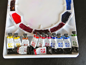
Once you've bought your paints, you'll need to arrange them in your palette.  I like to set up my round palette like a color wheel, somewhat.  With these 12 particular colors, it won't be an exact color wheel, but it will still be helpful.

Start with the yellows at the top, and work your way, counter-clockwise, around the color wheel (with the 2 earth colors between the yellows and the reds.


With the tube colors, I usually squirt about 1/2 the paint from a 14-ml. tube into each well of the palette, spread it with a palette knife so it fills up the bottom of the well, and then allow it to dry.

When I'm ready to paint, I activate it again and again, day after day, with a spray of water, before working.  In this way, I have all my colors in "cake like" form on my palette at all times, plus a liquid reserve still in the tubes.

You might find it helpful to label the wells with the names of the pigments, using a permanent black marker, like a Sharpie.


USING YOUR NEW PALETTE OF COLORS

Your washes might tend to "bead up" on a new palette, but -- no worries -- after several uses, they will mix more smoothly.

At the end of each painting session, add a few drops of water to each well of color and close the lid.  At the beginning of your next painting session, just mist your paints to wake them up.


COLORS TO ADD LATER

After painting for awhile, you may find yourself wanting to try some more colors.  You could easily add a few more paints to this kind of palette, with the extra wells in the corner.  

Some colors you might want to add later -- Raw Sienna, Quinacridone Violet, Cobalt Turquoise, Cerulean or Manganese Blue, Winsor (Phthalo) Green, Quinacridone Maroon, Quinacridone Coral.




Wednesday, November 28, 2012

BEHIND THE SCENES: Gathering & Creating Reference Material for My Farmers' Market Paintings


Gathering and creating reference material for future paintings is one of the most enjoyable parts of making art, for me.  This time, I was planning a series of Farmers' Market paintings for a gallery show.  This would be a two-step planning process, before I ever started the actual painting:  1)  Taking the pictures, and 2) creating the photo collages that I would use as references, while drawing and painting.


So, the first step was to visit the local Farmers' Market one Saturday to take lots of pictures.  I brought along my sister, so I'd have many photo references to use. . .


These are some of the photos that I used for the first painting . . . 


I used the photos to make photo collages.  I know many artists use Photoshop for this, but I like to spread out the pictures on my floor, rearrange them, cut them up, and paste them together into a pleasing composition.  I make a real mess, but it's fun. . . 


I used the above collage as reference, to paint this painting . . . 


More photos . . . 


Here's the collage I made with these sunflower pictures . . . 


And, here's the painting . . . 


I had to buy some of the gorgeous flowers, and some other goodies -- some were used in the paintings, and the goodies were just eaten . . . 


Here's the collage I put together with the above photos . . . 


and the finished painting . . . 


Here it is, framed and hanging in the gallery . . . 


One more collage . . . 


and the painting . . . 


Saturday, November 24, 2012

WATERCOLOR WORKSHOP: Negative Painting a Radial Design


Do you ever have days that you just want to paint for fun, but don't have the time or energy to plan it, or set up a still life, or find reference material, or think about your color palette?

If so, this painting project is perfect for those days.  You can look at a multi-petaled flower, if you like (mums, dahlias, zinnias, daisies) -- just to get the shape of the individual petals.  But, then, put away any references, so you don't get too hung up on making your drawing/painting look exactly like the flower.


_____________________________________

To download a PDF of this Tutorial, for $6, you can click here.  

_____________________________________


To begin this painting, wet your paper, and then paint the entire area with a very light wash.  I started with Quinacridone Gold.  Make sure it is very pale for this first wash. . . 


After your paper is completely dry, draw a tiny little circle, a little off center.  Now, draw an odd number of petals, radiating out from the little circle. . . 


Using the same color you used for your underpainting, in this case, Quinacridone Gold, mix up a big batch.  You will be painting wet-on-dry, so you'll need plenty of paint/water to cover all the negative space . . . (this should be just a little less pale than the first wash).  If it's not pale enough, add more water.  


To paint your wash over the negative space, use two brushes.  Start with a small round brush, so you can easily paint around the petal shapes . . . 


Once you have successfully painted around the petals, switch to a larger brush . . . 


Keep painting this wash, until you've covered all the negative space . . . 


After the paper is totally dry, draw some more petals -- vary the shapes somewhat, as well as the spaces between the petals. . . 


Using the same wash, with additional water added, plus more Gold pigment, paint the negative space -- wet on dry.  Remember to use your small brush to paint around the petals, and to switch to your bigger brush to paint the rest of the negative space.


After this dries, draw more petals, remembering to vary the shape and the length of each petal, as well as the spaces between the petals.  Let some petals touch, to form interesting little negative shapes. . . 


Then, paint the negative space again.  This time, add a little Quinacridone Burnt Orange or Burnt Sienna to your Gold wash.  No need to go too dark, too fast.

When that wash is dry, add more petals. . . 


Paint the negative space, wet on dry, with a wash that is mostly Quinacridone Burnt Orange or Burnt Sienna now . . . 


Once again, let that layer dry completely, and then draw some more petals . . . 


For this layer, use a wash of Quinacridone Burnt Orange or Burnt Sienna . . . 


Draw some more petals, taking some of them off the edge of the paper.  To your Burnt Sienna mixture, add some Quinacridone Magenta, and paint the negative shapes. . . 


Add more petals, and another layer of Quin. Burnt Orange/ Quin. Magenta mixture to the negative space. . . 


You can keep adding more petals and more layers of washes, as long as you want -- until you run out of paper. . . 


Try this same concept, using blues or roses, and differently-shaped petals.  You could also draw the petals bigger and wider for each layer.

__________________________________________________


To download a pdf of this tutorial, for $6, you can  click here.  
That way, you can easily print it out, with one step and one image per page, 
to have next to you, as you paint.


You can also get three tutorials, for $15, 
The three Negative Painting Tutorials are:
1) Trees, 2) Aspen Leaves, & 3) Zinnia (Radial Design)


Wednesday, October 31, 2012

WATERCOLOR WORKSHOP: Painting Pumpkins


Here's a step-by-step project for fall.  In this painting of pumpkins, we'll be doing wet-in-wet minglings, negative painting for depth, and transparent layering -- as well as using warm colors in the foreground and cool colors in the background.


Prep the following paints for your underpainting:  New Gamboge, Quinacridone Rose, and French Ultramarine.  


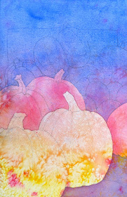
For your underpainting, first wet your paper with clear water.  Then, paint the yellow in the bottom third, the rose in the middle third, and the blue in the top third, letting them mingle together.  Spatter some of these colors, too, and lay it flat to dry.  When there is just a sheen on the paper, sprinkle some salt all over. . . 


When the paper is totally dry, brush off the salt.  Use your fingernail or a credit card if you need to -- just make sure all the salt is off. . . 


Draw two big pumpkins in the foreground -- one slightly below and overlapping the other one.  Indicate a shadow under the back pumpkin . . . 


Now, paint the negative shapes -- the area around the pumpkins -- with the Quin Rose and the French Ultramarine.  (Hint:  Turn your painting upside down to paint the negative space.  Start painting the rose wash around the pumpkins, gradually changing to a blue wash) . . . 


After this is dry, draw about three more pumpkins (or partial pumpkins) behind the foreground pumpkins.  Then, paint a pale blue wash over the negative shapes . . . 


When this is dry, draw a pile of pumpkins and gourds in the background -- a variety of shapes.  Also, draw a simple rectangle shape, to indicate a box or bin . . . 


Using a pale wash of Quinacridone Magenta, paint the background negative shapes.  Paint the shadows under the foreground pumpkins with this magenta wash, too . . . 


Now that we've established the depth with the negative painting, we can start developing the pumpkins, with transparent layering.  Working one shape at a time, paint the foreground pumpkins with transparent washes, mingling yellow, red, and burnt orange (or burnt sienna).  Paint every other shape, so the adjacent shape isn't still wet.  On the background gourds, use burnt orange on some and sap green on others. . . 


Continue painting shape by shape, until you've painted all the pumpkins and gourds -- staying transparent, so that the underpainting and texture can still be seen.


Mix up two different darks -- magenta + blue + burnt orange, and magenta + burnt orange.  Paint the stems and the part of the shadow directly under the pumpkin.  Add some darks to the foreground pumpkins. . . 


Finish the painting with some blue glazing on the background gourds, more darks on the stems, and a dark blue glaze on the background shape (French Ultramarine + Magenta + Burnt Orange). . .