Pages

Wednesday, October 31, 2012

WATERCOLOR WORKSHOP: Painting Pumpkins


Here's a step-by-step project for fall.  In this painting of pumpkins, we'll be doing wet-in-wet minglings, negative painting for depth, and transparent layering -- as well as using warm colors in the foreground and cool colors in the background.


Prep the following paints for your underpainting:  New Gamboge, Quinacridone Rose, and French Ultramarine.  


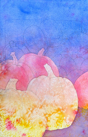
For your underpainting, first wet your paper with clear water.  Then, paint the yellow in the bottom third, the rose in the middle third, and the blue in the top third, letting them mingle together.  Spatter some of these colors, too, and lay it flat to dry.  When there is just a sheen on the paper, sprinkle some salt all over. . . 


When the paper is totally dry, brush off the salt.  Use your fingernail or a credit card if you need to -- just make sure all the salt is off. . . 


Draw two big pumpkins in the foreground -- one slightly below and overlapping the other one.  Indicate a shadow under the back pumpkin . . . 


Now, paint the negative shapes -- the area around the pumpkins -- with the Quin Rose and the French Ultramarine.  (Hint:  Turn your painting upside down to paint the negative space.  Start painting the rose wash around the pumpkins, gradually changing to a blue wash) . . . 


After this is dry, draw about three more pumpkins (or partial pumpkins) behind the foreground pumpkins.  Then, paint a pale blue wash over the negative shapes . . . 


When this is dry, draw a pile of pumpkins and gourds in the background -- a variety of shapes.  Also, draw a simple rectangle shape, to indicate a box or bin . . . 


Using a pale wash of Quinacridone Magenta, paint the background negative shapes.  Paint the shadows under the foreground pumpkins with this magenta wash, too . . . 


Now that we've established the depth with the negative painting, we can start developing the pumpkins, with transparent layering.  Working one shape at a time, paint the foreground pumpkins with transparent washes, mingling yellow, red, and burnt orange (or burnt sienna).  Paint every other shape, so the adjacent shape isn't still wet.  On the background gourds, use burnt orange on some and sap green on others. . . 


Continue painting shape by shape, until you've painted all the pumpkins and gourds -- staying transparent, so that the underpainting and texture can still be seen.


Mix up two different darks -- magenta + blue + burnt orange, and magenta + burnt orange.  Paint the stems and the part of the shadow directly under the pumpkin.  Add some darks to the foreground pumpkins. . . 


Finish the painting with some blue glazing on the background gourds, more darks on the stems, and a dark blue glaze on the background shape (French Ultramarine + Magenta + Burnt Orange). . . 


Thursday, October 25, 2012

VEGETABLES: 10 Sketchbook & Color Exercises to Try


THE SECRET TO HAPPINESS (according to something I just read on the Internet) -- IS VEGETABLES!  I guess you have to actually eat them in order to truly be happy, but we're going to draw and paint them, too.

For these exercises, work "from life", if possible.  Visit your local market, grocery store, or farmer's market, and fill your cart or basket with lots of interesting colors and shapes.

Now, try a few, or all, of these exercises/studies -- either in your sketchbook, or on scrap pieces of watercolor paper:


1)  PUMPKIN with SCARF -- Set up a pumpkin, with a patterned scarf draped around the base of it.  Start with a wet-in-wet underpainting (use warm colors).  When that's dry, draw the pumpkin and scarf.
Draw a "frame" behind the pumpkin, and paint a transparent wash over this background shape.  Paint the pumpkin and the scarf, adding some darks in the stem, and some cobalt blue washes for the shadows. . .


2)  A BUNCH OF CELERY -- In your sketchbook, draw a bunch of celery, in pencil -- add shading.  Draw two different views of the celery, on the same page. . . 


3)  BELL PEPPERS with DARK BACKGROUND -- Draw and paint 1 or 2 colorful bell peppers.  Add a horizontal line for a tabletop, and paint the background dark. . . not black, but dark. . . 


4)  PEPPERS ON A PLATE -- Put several different kinds of peppers on a plate.  Draw a bird's-eye-view of the peppers -- a contour drawing in ink.  Do a wet-in-wet painting for the color.  (You can either do the painting first, and then add the ink contour drawing; or draw it in ink first, and then add the color.)


5)  CARROTS -- Set a bunch of carrots, with the greens still attached, on a piece of white paper on a table.  Draw and paint the carrots, adding light blue shadows . . . 


6)  EAR OF CORN -- Do a contour drawing, in pencil, of an ear of corn -- either fresh, or use Indian corn. . . 


7)  WARM PEPPERS/COOL BACKGROUND -- Set up 2 or 3 colorful peppers on a tabletop, with or without a tablecloth.  Draw and paint the peppers with bright, warm colors.  Paint the background with cool colors. . . 


8)  STILL LIFE IN KITCHEN -- Set up a simple still life in your kitchen, with salad ingredients.  Do a contour drawing in pencil, and then paint a value study, with Burnt Sienna (or Quin Burnt Orange). . .


9)  PATTERNED GOURDS -- Are gourds considered vegetables?  Probably not, unless they're squashes?  Well, for our purposes, they are vegetables.  Find some gourds or squashes, with interesting patterns or stripes.  Draw and paint a few small color studies. . . 


10)  STILL LIFE WITH PEPPER -- Set up a simple still life that includes one bell pepper in the foreground.  Draw the still life with pencil -- adding shading to the pepper, only. . . 


Are you happy yet?  If not, you may just have to cut up those veggies, throw them into a pot, with a little broth, herbs & spices, and salt & pepper, and turn them into soup. . . 


Monday, October 22, 2012

PAINTING COLOR WHEEL MANDALAS: BEHIND-THE-SCENES VIDEO OF BEGINNING WATERCOLOR WORKSHOP


Just back from Ohio, where I taught a 2-day Beginning Watercolor Workshop.  We painted Color-Wheel Mandalas, using photo references, and Pumpkins, drawn and painted from life.


After drawing the circle and separating it into 6 sections (using compasses, protractors, and straight-edges), they painted washes of color, using only the 3 primary colors.  An Aureolin Yellow wash was painted on the yellow/green/orange sections.  A Quinacridone Rose wash was painted on the red/orange/violet sections.  A Cobalt Blue wash was painted on the blue/green/violet sections.

After doing the underpainting on the Color Wheel, we painted a wet-in-wet mingling on a separate piece of paper, using warm colors, and sprinkling salt/spattering color on it.

Using photo references, they drew and painted each of the color sections of the Wheel.  Those who had time, painted a pumpkin from life.

Every one of the 9 ladies at the workshop did a beautiful job, and I'm fairly certain that they will be painting again!  Yea!

Tuesday, October 9, 2012

SKETCHBOOK/COLOR STUDY ASSIGNMENT: BLUE -- 10 Exercises to Try


Try a few, or all, of these "very cool" BLUE exercises . . .


For the first 5 color studies, you will need some watercolor paper (this can be a watercolor sketchbook, paper from a watercolor pad, scraps of good watercolor paper, or the backs of your old paintings).  You'll also need your watercolor brushes and paints, and a black felt pen . . .


1)  FACES --

Start with a wet-in-wet underpainting, using all your blues, and a few analogous colors (like green and magenta).  Let this dry completely.

Find some faces from your magazines, and tear them out to use for references.  (For this exercise, I recommend not using photos of people you know, because then you'll be too worried about getting a likeness).

Cut up your painted watercolor paper into 4 x 6 pieces, and do a contour drawing of a face, using a black felt pen, on each one . . .


(The faces above are from my Face-A-Day Project -- my personal 365-day project from 2011.)


2)  A WINTER SKETCH -- 

 Without drawing first, paint a quick color sketch, that gives the "feeling" of winter . . .   


3)  BLUE SKY SAMPLER --  

Draw a grid on one piece of watercolor paper, or use 4 separate rectangles of paper.  Paint a different blue sky in each one -- a) Wet the paper first with clear water; then, paint two different blues.  As it is drying, roll a little piece of tissue across the paper, for clouds.  b) Wet the paper; then, paint a pale blue and a very pale magenta.  Then, lift out some of the paint with a damp brush, as it's drying.  c)  Draw and mask a little circle, for the moon.  Paint the sky with two different blues.  Roll a tiny piece of tissue across the moon for a cloud.  If the sky is not dark enough for a night sky, wait until it is dry, and paint it again with the blues.  Remove the masking after it is dry.  d) Paint a blue wash onto dry paper.  While this is still wet, paint a few "stripes" of another blue.  Roll a piece of tissue for the clouds.


4)  A FISH "OVER" WATER --

Start with a wet-in-wet mingling on a small piece of watercolor paper, using a granular blue (like Cerulean Blue or French Ultramarine) plus a little of an earth color or two (like Quinacridone Gold).  When this is dry, draw a fish, and then paint it, keeping most of the fish transparent, so as not to totally cover up the underpainting.  Finish with a few darks on the fish . . . 


5)  BLUE "WAVES" --

On dry paper, paint some big wavy, watery swaths of color -- mostly blues, with a little magenta and/or red -- leaving just a few bits of white showing.  While this is drying, paint some more wavy lines, using more pigment this time (French Ultramarine and Phthalo Blue).  Finish with a little spattering of red. . . 


______________________________________________________


You'll use your sketchbook for the next 5 exercises . . . 


6)  IMPRESSIONS OF YOUR DAY -- Using a blue fine marker, draw a few images of some things in your environment -- and then, jot down a line or 2 next to each one -- all on the same sketchbook page.  Then, date the page. . . 


7) A "BLUE" BIRD --

Draw a bird, either from life or from a photo, in pencil.  Add color with colored pencils (or watercolor pencils), using different blues, and adding a few spots of warm colors, for contrast. . . 


8)  BLUE GESTURES --

Using a blue ballpoint pen, fill up 2 pages of your sketchbook with quick "gesture" drawings -- at a dance class, playground, or yoga class . . . 


9)  SAILBOATS SURROUNDED BY BLUE --

With a soft 6B pencil, or a charcoal pencil, draw a sailboat in the water, near a dock or harbor.  With your watercolors, paint some wet blues for the sky and the water, leaving a few white shapes.  Add a few spots of bright warm color, and finish your sketch with some darks (pencil or paint). . .


10)  JUST FOR FUN -- 

While looking at a stone wall, draw just the cracks, with a contour line in black felt pen.  Choose one of these shapes, and turn it into a little creature.  Draw a frame around it with some lines in the background, to break up the negative space.  

Now, try some paint "sanding" in some of the background shapes.  Wet one of the shapes with clear water, and then, rub the end of any blue watercolor pencil on a sandpaper block, so the particles land on the wet shape.  (This only works with watercolor pencils, not regular colored pencils.)


All right!  Now it's time for a cup of hot tea (or hot toddy), to warm up . . .

Saturday, October 6, 2012

TOP TEN: 10 Things Every Watercolorist Should Know About BLUE

This week's theme is cool and calm BLUE, the overwhelming "favorite color".


 BLUE surrounds us -- it is the color of peace, order, strength, and the spirit -- symbolized by the blue sky and the vast blue ocean.  BLUE evokes serenity, innocence, truth, sadness.


Here are 10 important things about the color BLUE that I think everyone who paints in watercolor should know:  (I'm also including some "blue" paintings of mine, as well as quotes about blue from others.)


1)  BLUE IS THE COOLEST COLOR ON THE COLOR WHEEL, bringing a soothing element to any painting.  Of the three primary colors, it is the only cool one.


"Blue color is everlastingly appointed by the deity to be a source of delight." -- John Ruskin


2)  BLUE VISUALLY RECEDES.  Any color that we associate with the sky -- especially blues -- tend to be recessive, stubbornly recessive.  Another characteristic of BLUE is its POWER TO SUGGEST INFINITY or DEEP SPACE -- beyond that of any other color.  Because of this, blue is a good color to use for your background, and also as a glaze, in order to set something back in space.


" . . . introduce into our light vibrations, represented by the reds and yellows, a sufficient amount of blueness to give the feel of air."  -- Paul Cezanne


3)  BLUE'S COMPLEMENTARY COLOR IS ORANGE.  Side by side, these two colors create a vibrancy.  Interestingly though, if you put these two colors next to each other, at the same intensity and the same size, the cool blue will still recede, and the warm orange will still advance.


"There is no blue without yellow and without orange."  -- Vincent Van Gogh


4)  YOU SHOULD HAVE AT LEAST 3 BLUES ON YOUR PALETTE, since all blues are not considered equal.  Blues have what's called a "hue bias", which is the different mixing potential of each blue (whether the color leans towards green or red).  It's good to have a blue with a GREEN BIAS, like a Phthalo Blue; a blue with a RED BIAS, like French Ultramarine; and a good blue for glazing, like Cobalt Blue.  Having a green bias, means that this blue will mix with yellows to make beautiful greens.  Having a red bias, means that this blue will mix nicely with cool reds to make violets.


"Oh, suns and skies and clouds of June, and flowers of June together.  Ye cannot rival for one hour October's bright blue weather." -- Helen Hunt Jackson


5)  PHTHALO BLUE (also known as Winsor Blue or Rembrandt Blue) IS A BRIGHT AND INTENSE BLUE THAT CAN BE VERY DARK.  Used as a thin glaze, it is very transparent.  It is a staining pigment, which means it is hard to lift.  Phthalo Blue can easily overwhelm other colors, unless it is used sparingly.  But, this makes it excellent for mixing darks.


"Beyond the head, instead of painting the banal wall of the mean room, I paint infinity.  I make a plain background of the richest, intensest blue that I can continue, and by this simple combination of the bright head against the rich blue background, I get a mysterious effect . . . " -- Vincent Van Gogh


6)  COBALT BLUE IS AN ESSENTIAL BLUE FOR YOUR PALETTE -- GOOD FOR PAINTING SKIES & SHADOWS, BUT NOT GOOD FOR DARK MIXTURES.  I use it a lot for glazing and in portraits.  Cobalt blue is translucent and lifts easily.  It's also somewhat toxic, by the way.  This is a great all-round color for underpainting, layering, and mixing with other colors -- just not for darks.


" . . . cobalt blue, ultramarine blue . . . necessary for painting."  -- Pierre Auguste Renoir
(from the artist's notes, describing his palette)


7)  FRENCH ULTRAMARINE -- A SEDIMENTARY COLOR -- CAN BE VERY USEFUL, DEPENDING ON WHAT YOU'RE PAINTING.  Because of its granular quality, it's good for painting beach scenes, landscapes, barns -- but not portraits (at least not for the skin).  Use French Ultramarine, mixed with Quinacridone Burnt Orange, when painting rocks, trees, bark, and stone.
This color is attractive when applied wet-in-wet, because it settles and doesn't spread uncontrollably.
French Ultramarine is a very saturated royal blue, biased slightly toward red, so it makes a beautiful purple.  This color will dry lighter than you think, and it lifts easily.

The highest quality ultramarine blue is made with powdered lapis lazuli from Afghanistan.  (Not really important for you to know, I guess, but I thought it was interesting.)


"Of all the colors, blue and green have the greatest emotional range.  Sad reds and melancholy yellows are difficult to turn up." -- William H. Gass


8)  CERULEAN BLUE IS A BEAUTIFUL, LIGHT BLUE PIGMENT THAT CAN ACT AS A TRANSPARENT COLOR, WHEN MIXED WITH LOTS OF WATER AND APPLIED TO WHITE PAPER.  It is not a good color for mixing or glazing/layering, since it is opaque and can be rather chalky.  It also has a granular quality, and is a good pigment for spattering.


"If you see a tree as blue, then make it blue." -- Paul Gauguin


9)  BLUES MAKE BEAUTIFUL, "COLORFUL" GRAYS.  I know that seems like an oxymoron, but the grays you get when mixing blues and other colors, are so much more interesting than the tube grays.  You're able to "push" the gray towards blue or rose.  You can also apply a cobalt blue glaze over a busy or too-bright background, to gray it a little and calm it down.  Using a blue mixture for your shadows is much more effective and harmonious than just using a Payne's Gray wash, for example.


"Hold onto your divine blush, your innate rosy magic, or end up brown.  Once you're brown, you'll find out you're blue.  As blue as indigo.  And you know what that means.  Indigo.  Indigoing.  Indigone.  -- Tom Robbins, in "Jitterbug Perfume"


10)  BLUE HAS A BROAD VALUE RANGE, from tints to shades (unlike yellow, which never gets dark, without turning into brown).  Strong blue hues retain their color identity at the darkest value, and at the lightest value (unlike red, which becomes pink at its lightest value).  


_____________________________________________________________________________


Pablo Picasso's "Blue Period" paintings, in which the color blue dominated, were a marvelous expression of poetic subtlety and personal melancholy, and contributed to the transition of his style, from classic to abstract.  These were painted between 1901 and 1904.