Pages

Saturday, June 30, 2012

WINDOW PANE: Paintings & Watercolor Exercise

DAY #1 -- Using the square window pane as the basis for a watercolor technique exercise; and, showing how I used the window pane design in a series of paintings.


MY WINDOW PANE SERIES

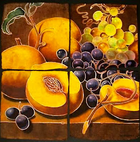
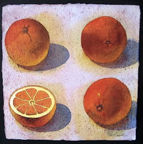
For each of these, I painted separate little paintings, which were then mounted to form one big painting . . .


The small paintings were done on 10" x 10", or 12" x 12", handmade watercolor paper squares, which were then mounted on black mat board, leaving a 1/2" space between them, so that it looked like window panes.


I did not paint one big painting and then cut it up into smaller squares.  I guess I could have done it that way, but these small handmade paper squares have such beautiful deckled edges that aren't perfectly straight -- I would have lost that.


This paper, called "Indian Village" handmade paper, is a challenge to paint on.  It sucks up the watercolor like a sponge, so you have to apply many layers in order to get bright colors.  I also chose to draw my shapes with liquid acrylic, which acts like a dam for the watercolor washes.  But, the resulting texture and 3-dimensional quality that I got, made the challenge worth it.


I also enjoyed designing my paintings in this modular way, resulting in this windowpane effect.


________________________________________________________________________


WINDOWPANE EXERCISE -- A sampler of watercolor techniques to try . . . 


On a scrap of watercolor paper, draw a big square, and then do a simple contour drawing of a big pear, with a cast shadow.


On top of this drawing, draw two straight lines, dividing the square into 4 equal sections, like four window panes.  Around the edges, label the sections with the technique you are going to use.  You will paint each section separately, and a little differently. 

Top Left -- Paint the background shape first, using salt for texture.  When that is dry, paint the yellow shape of the pear.

Top Right -- Paint the yellow pear first, sprinkling in salt for texture.  When that is dry, paint the background shape.  Remember to only paint the portion of the pear that is within that section.

Bottom Left -- Paint each shape within this section separately -- wetting the shape first, and then dropping in color, letting the colors mix and mingle within each shape.

Bottom Right -- Paint each shape as a graded wash -- painting wet on dry.  Start painting each shape with a color, then switch to another color within that shape, while the first color is still wet.  Be sure to use enough water, so the colors mix easily.


When all this is dry, you can go over your lines with a black pen.  


Thursday, June 28, 2012

THE SQUARE: 10 DAYS, 10 WAYS -- Introduction

Presented over the next two weeks, this series will include 10 days' worth of SQUARE STUFF -- sketchbook exercises, watercolor tutorials, design ideas, how-to's, painting examples, and behind-the-scenes photos.  You'll be amazed at all the ways you can use the square in your drawing and painting.


The square is one of the 5 universal symbols, found in almost all cultures -- the other 4 are the circle, the triangle, the spiral, and the equidistant cross.  Of these 5 symbols, the square is the only one that is not found in nature -- and yet, in many cultures, it represents the earth, stability, solidity, foundation, and balance.  It also represents the #4, and the four cardinal directions, the four seasons, and the four elements.


There are so many ways to use the square in your art -- as a format, a design element, a grid, a drawing tool, the basis of a pattern, a checkerboard, a symbol, a mosaic, a quilt, a composition tool . . .  I had a hard time narrowing it down to just 10 ways.


I hope you'll join me over the next two weeks in exploring the SQUARE . . .

Monday, June 25, 2012

TOP TEN: Favorite Fruit to Paint

These are my 10 favorite fruit to paint, with examples of my paintings over the years, for each fruit:


1)  PEACHES --


2)  CHERRIES --


3)  GRAPES -- 


4)  APPLES --


5)  PEARS --


6)  ORANGES --


7)  MELONS --


8)  PINEAPPLE -- 


9)  PUMPKINS --


10) PLUMS --


Sunday, June 24, 2012

BEHIND THE SCENES: From my One-Day Watercolor Workshop


Music is "Appalachian Spring", by Aaron Copland

WATERCOLOR WORKSHOP: Painting Apples on a Window Sill


In this watercolor project, we'll be painting a few Granny Smith apples, sitting on a windowsill in the kitchen, with patterned tiles beneath the sill.  We'll be using various techniques, including transparent layering, mingling, glazes, and a little salt at the end for texture.

I used 7 different pigments for this project -- aureolin yellow, quinacridone gold, quinacridone rose, quinacridone magenta (can you tell I have a thing for quinacridone colors?), cerulean blue, cobalt blue, and sap green.


Prep 3 colors on your palette, to be used for the wet-in-wet underpainting:  aureolin yellow, quinacridone rose, and cerulean blue. . . 


Wet your paper with clear water.  Then paint these three colors, in "stripes".  Since we're painting wet-in-wet, there should be no hard edges to these stripes . . . 


Let this dry on a flat surface.  When it is completely dry, do a pencil drawing.  Start by drawing a straight horizon line, about a third of the way down from the top.  Measure and use a ruler for this line.  If it's not level, it will look like the apples are going to roll off.  Now, draw a few apples, sitting on this line.  Add a few more horizontal lines to indicate a window sill, and then draw a simple pattern underneath the sill. . . 


Clean off your palette, and mix up a simple yellow wash.  Paint each apple with this yellow wash, wetting each first with clear water.  Then, paint some of the pattern shapes yellow. . . 


To the yellow wash on your palette, add some cerulean blue, to make a green.  Also prep some sap green, mixed with a little cerulean blue.  Wet each apple separately with water, and drop in these colors.    
Then, mix a cerulean blue wash, and paint some of the pattern shapes with the blue.  Paint over some of the yellow shapes, to make a green. . . 


Clean off your palette, and mix a wash of the quinacridone rose.  Paint the windowsill with this rose wash.  When that is dry, paint another layer of that same wash on the middle shape of the sill.  Then, use this rose to paint a few more of the pattern shapes.  If you paint the rose over some of the blue shapes, it will make a violet.  When you paint the rose over some of the yellow shapes, it will make an orange. . . 


After this is dry, paint a wash of quinacridone gold over the windowsill, to warm it up.  Then use the same wash to paint a few more pattern shapes and the lines between the squares. . . 


When this is completely dry, paint a few darks in the apples -- right at the bottom of each (sap green plus cobalt blue), and the stems (magenta plus blue plus quin gold).  Use the dark magenta to paint a dark under the windowsill, to give it some dimension.  Now, paint some magenta pattern shapes.  Paint some shapes within the shapes.  No need to draw first, unless you want to.


To finish your painting, paint a glaze (wash) of cobalt blue over the pattern area.  When there is just a sheen on the paper, sprinkle some salt on the wash and let it dry.  

When this is completely dry, brush off the salt . . . 


This final blue glaze subdues the pattern a little, and the salt gives it a subtle, "weathered" look.  Your focal point should be the apples and not the pattern.  If they compete with each other, you need to tone down one of them.  (There can't be two stars of the show.)


Thursday, June 21, 2012

FRUIT: 10 Sketchbook & Color Exercises to Try


After a trip to the grocery store or farmer's market -- try a few, or all, of these exercises.  Use your sketchbook for the drawing, and use scraps of watercolor paper for the color exercises -- or a watercolor sketchbook, if you have one. . .


1)  Cherries in a Box -- With a pen, draw any fruit and whatever container you brought it home in.  Add a little color with watercolor or colored pencils.  Then, write in pen, where the fruit came from and what day it is.  Make the words part of your composition . . .


2)  Imagination/Observation/Memory -- Use three separate pages for this exercise.  One the first page, draw a few pieces of fruit, and a few other random objects, without looking at anything -- just from your imagination  Use pencil. . . 


On the next page, look at the fruit and other objects, and draw them in pencil, adding shading . . . 


Now, put away the fruit and objects -- and on the next page, draw them from memory. . . 


3)  Colorful Pear -- This exercise is more of a color study than a study of a pear, so no need to even look at a pear.  Just draw an outline of a pear with a stem.  Then draw some wavy lines that start on the edges of your page, intersecting the pear and ending on the other side of the page.  Now, paint the shapes, one at a time -- Use any color you want and try the different wet-in-wet techniques.  In some of the shapes, wet the shape first with clear water, then drop in color to the edge and let it move on its own.  In some of the other shapes, wet the shape with a color, and then drop in another color to the edge and let it mingle.  Skip around so that you're not painting right next to a shape that's still wet.  If you want, you can paint all the shapes within the pear "warm" colors, and all the background shapes "cool" colors. . . 


4)  Still Life Drawing, Two Ways -- Set up a simple still life with fruit in a bowl, on a dishcloth or tablecloth.  On one page, draw a contour drawing of the set-up in ink. . . 


On the next page, draw the same set-up in pencil, with shading . . . 


5)  Pear Triptych -- Divide a long skinny scrap of watercolor paper into thirds.  Paint a light yellow wash over the whole thing.  When that is dry, draw a big pear in each rectangle.  Now, paint each part of the triptych in a different color scheme.  The one on the left will be "complementary color", so paint the pear yellow and the background violet (or the pear orange and the background blue, or the pear red and the background green).  The one on the right with be "analogous colors", so paint the pear green and the background blue-green and blue.  The one in the middle will be "split-complements", so if you leave the pear yellow, the background will be red-violet and blue. . . 


6)  Blind Contour -- Do contour drawings of fruit, in pencil, without looking at your paper -- only look at the fruit . . . 


7)  Quick Color Study, Two Ways -- Set up a simple still life in front of a window -- an orange, two apples, and a little vase, for example.  Paint this set-up two ways:  1-"Draw" the still life with a brush and orange paint.  Then, paint it . . . 


On a separate scrap of watercolor paper, paint it a 2nd time.  This time, draw it first in pencil, quickly.  Then, paint it quickly and directly, using very bright colors.  If you want, set a timer for 15 minutes and try to finish the study within that time. . . 


8)  Bird's-Eye View -- Draw some fruit in a bowl, with pen and ink.  Add lines and cross-hatching to build up the values. . . 


9)  Strawberry -- Draw and paint one big, red strawberry.  When dry, lift out the little dots . . . 


10)  Value Pencil Studies -- Draw some fruit, in pencil or charcoal.  Add shading to build up the values and add form. . .